Pawfriends
A responsive web that facilitates pet adoption by simulating the pet owning experience with AR.
Scope
UX Research
Storyboarding
UI Design
Product Design
My Contribution
UI/UX Design
Contextual Inquiries
Journey Mapping
Storyboarding
Branding Design
Introduction
From the research and interviews our team has collected, we’ve found a consistent pain point that has appeared within almost every pet owner’s first-time journey: “I have some idea of what kind of pet I want to adopt. But how do I know if they’re the right fit for me and my life?”
Streamlining the adoption process for customers is also beneficial for adoption centers since it will ultimately reduce time and energy for workers and in turn increase the number of successful pet adoptions. Additionally, we want to simulate the pet owning experience via AR to make the process engaging, fun, and easy to consume. Pawfriends will help the potential pet owners to better understand how their dream pet would fit into their lifestyle.
Challenge
Our team decided to focus on exploring how we can improve present pet adoption processes from a daunting and arduous process to an exciting and confidence-building one. Overall, redesigning the pet adoption experience introduced many challenges and opportunities as we strived to connect user research with potential design interventions. We aimed to create a responsive website that would cater to various busy schedules and lifestyles and also increase shareability.
Early Stage Research
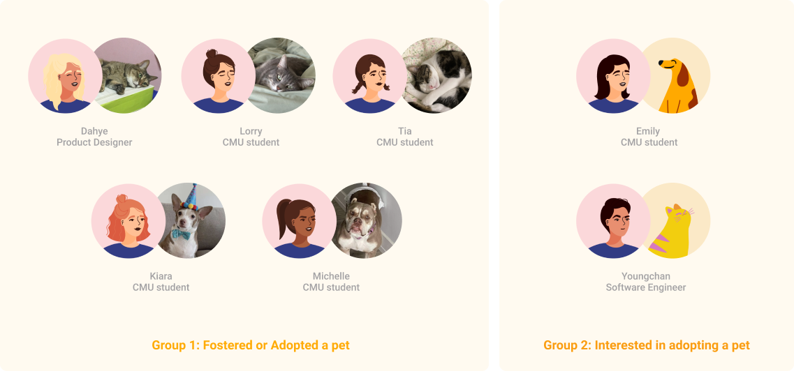
We conducted Semi-structured Interviews and Contextual Inquiry (Directed Storytelling) with our potential users. Largely, there were two groups of our target users: people who have experience in adopting or fostering a pet and people interested in adopting a pet in the future.
Key Findings
Current Journey Mapping
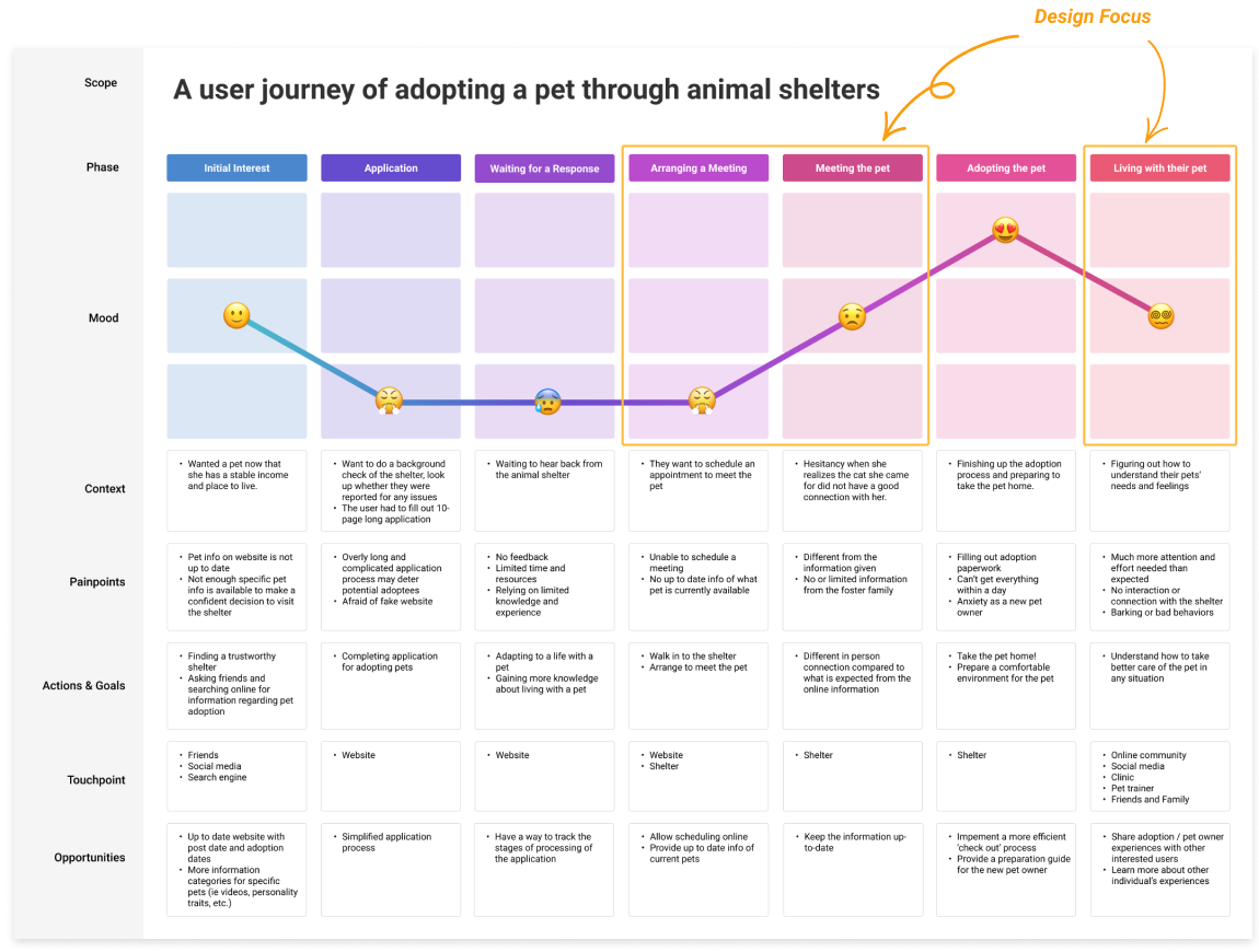
We first split the customer journey into seven phases, encompassing the whole journey from making the initial decision to adopt, to the adoption process, to living with the pet. For each step, we provided context, which is the data that we collected that we found the most relevant for what we want to accomplish in our project. Following individual users' journeys helped us empathize and understand the user's pain point better. We also included touchpoints at each phase to determine what customers interact with and find any opportunities to change our website to improve the status quo.
From four individual maps, we synthesized them into one customer journey depending on different phases. We first focused on the commonalities between individual maps and consolidated them into higher concepts. While drawing out the final map, we could narrow our design scope and focus on users’ major pain points on the specific phases.
Opportunity
How might we consolidate an animal’s information while also elevating that information to make it engaging, fun, and easy to consume?
Storyboarding
After the brainstorm session, we picked one idea to further explore its potential value and feasibility with storyboarding.
Looking back at the journey map we had created, we realized that the third pain point was not addressed. The third pain point is about unexpected challenges in living with a pet after adoption. We decided to further the storyboard we had created.
Wireframing
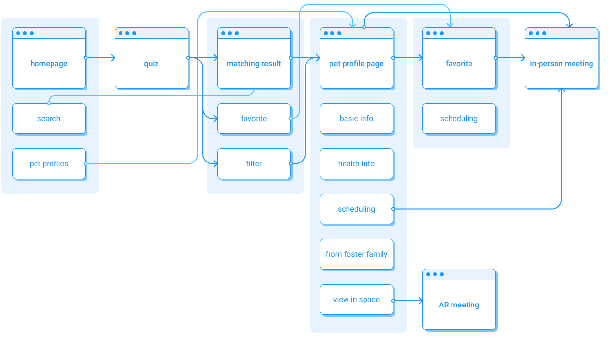
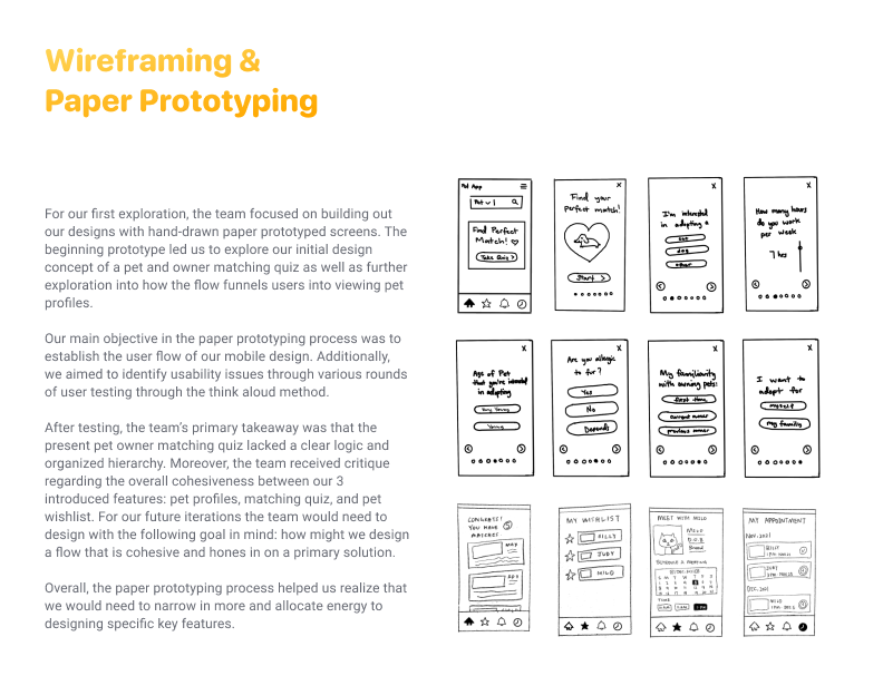
Using insights from the customer journey map, we began to identify the “low points” or user pain points on the map to begin ideating potential solutions for the overall process. We started by organizing a big picture wireframe site map.

Solution
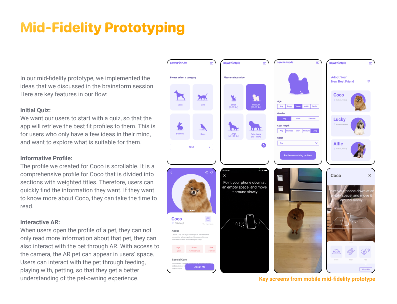
Initial Quiz
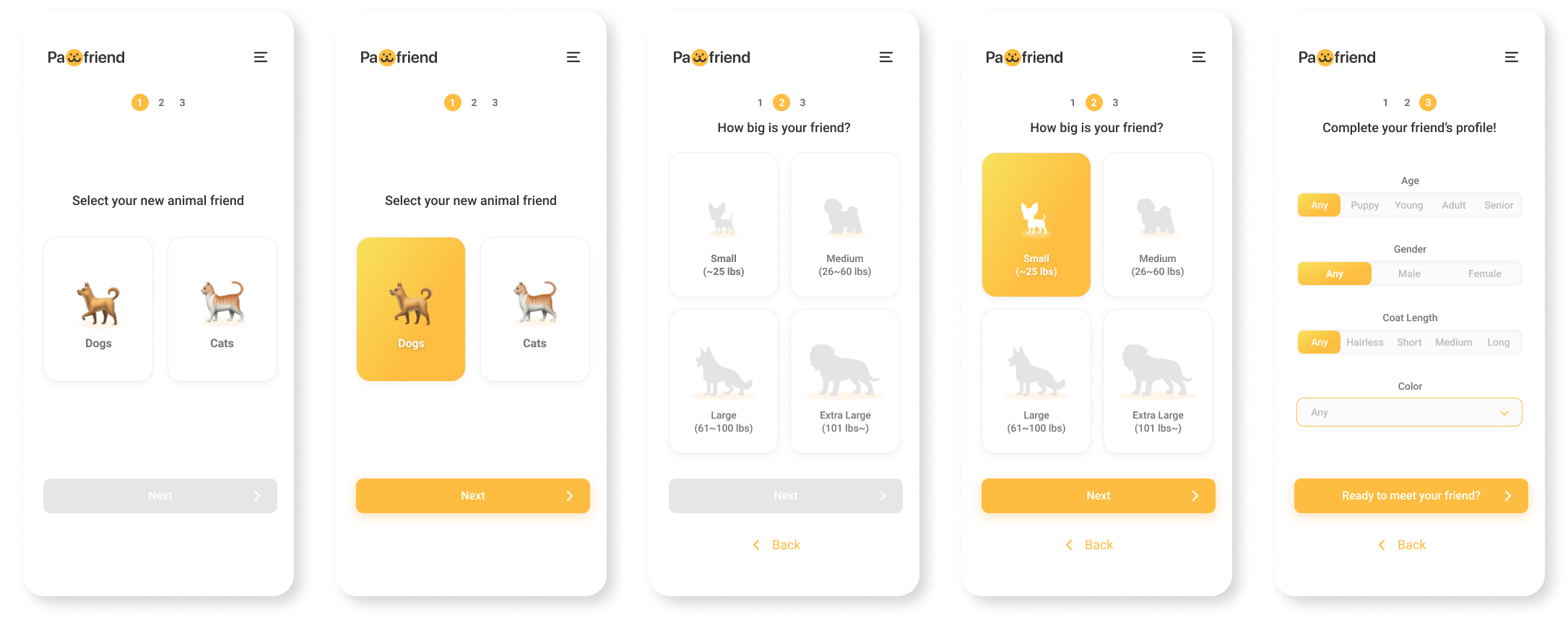
Easy start. Exploring with a vague idea
Retrieving the best fit profiles
Order of the quiz with clear logic and hierarchy

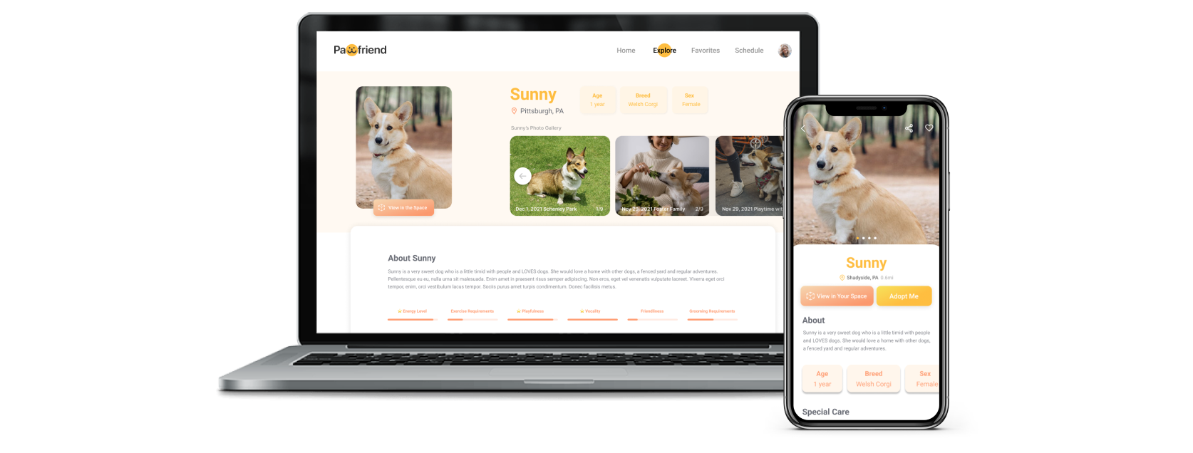
Informative Profiles
Comprehensive profile
Easy find with weighted titles
Add to Favorites to save profiles

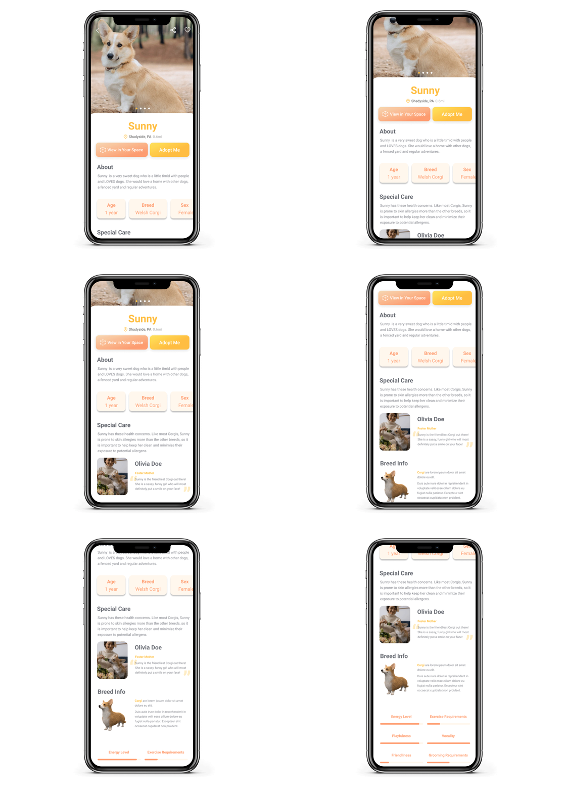
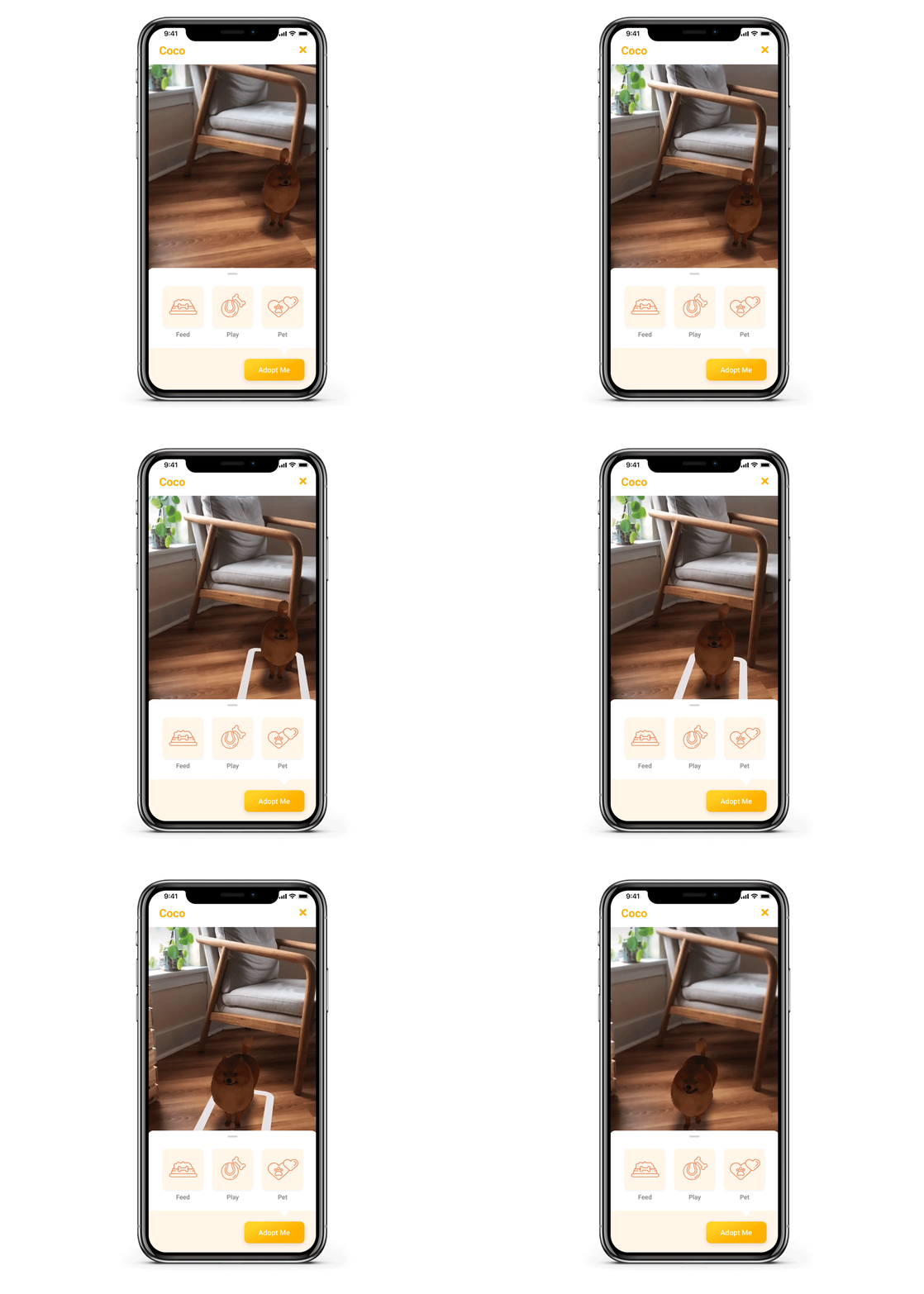
Interactive AR
Interactive pet owning experience
Feed, pet, and play with the pet
View in the home space
Responsive Website
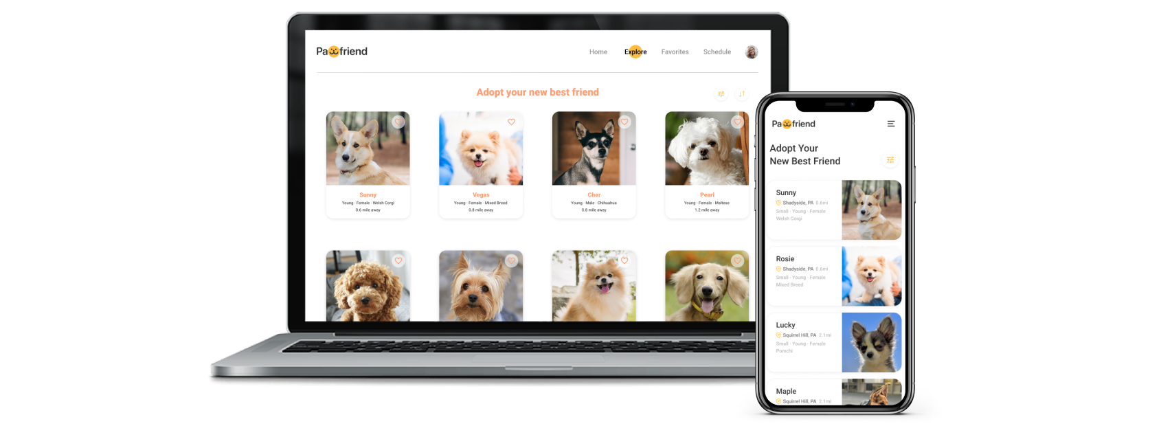
Instead of designing an app, our team aimed to create a responsive website that would cater to various busy schedules and lifestyles and also increase shareability. We created dynamic changes to the appearance of a website, depending on the screen size and orientation of the device being used to view it. The two primary screen sizes that we chosen are phone screen and desktop. I will introduce some key reshuffling.
01. Navigation Bar
We received some feedback that our mobile version looked like an app due to the menu bar at the bottom, so we changed the menu bar at the bottom to a the hamburger menu so that it looked more like a mobile site.
For our desktop design, we had to rearrange some sections to accommodate the larger screen size. Similar to the mobile screen, we changed the theme color to an orange-yellow to match our new logo.
02. Grid
The responsive website we designed will adapt itself with different grid system to the size of a user’s screen.
03. Camera Access
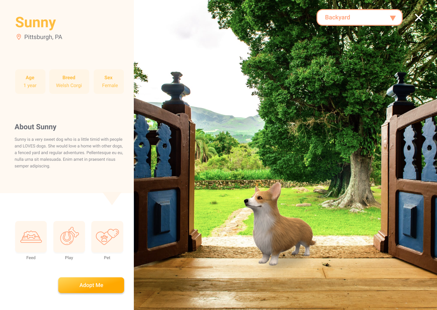
For some devices that don’t have access to a camera such as laptop, our responsive web will provide a sample setting of space. Users can change the setting to apartment, yards, outdoors, etc based on their needs.
Iterations
Improved information hierarchy.
Removed the tab and replaced with a menu to fit the responsive web on mobile phone.
Created a design system and branding,
Added an AR feature to pet profiles.
Arranged the priority of main functions on the navigation bar.
Switched our focus from scheduling to consolidating the animal information.
Improved the playfulness of the AR feature to better connect the users.
Here are some key iterations that we went through:
Final Design
Mobile
Desktop
Reflection
Overall, I am very proud of our final responsive web design, and it is obvious how much progress was made with each iteration. This project really immersed me in a real UX project experience. We started with UX research, like contextual interviews. Then we moved on to synthesized insights and generated design solutions that address key pain points.
The biggest takeaway for me is that focusing on pain points before designing can better incubate creative ideas. Before the mid-fidelity prototype, we focused too much on aesthetics and completing the flow rather than the pain points, so our work seemed to lack creativity. Later on we decided to focus on helping users to find the right fit, and everything came together.


