Spin Dashboard
A data dashboard that improves scooter operations and growth
Role:
UX Designer for a sponsored project
Timeline:
Jan 2022 - Apr 2022
Tools Used:
Figma, Adobe CC
Introduction
Spin is one of the leading micromobility companies that offer electric scooter sharing services. Spin has provided the Pittsburgh community with scooters as an alternative last mile transport option, and has made going around the city much more fun. Through scooter operations, Spin has data on the trip and scooter information, and the availability of the scooters throughout the week. Our team want to use this data to create a dashboard that bring many elements of dynamic information together. Through this dashboard, employees can achieve their business and personal goals, and company can benefit from improving scooter operations and service.
Challenge
Using scooter data, our team want to create a dashboard that helps improve workflow and address problems Spin employees face, and thus improve growth rate for Spin. We need to figure out all stakeholders that are involved, and create personas for specific stakeholders that we can improve their work with a data dashboard. Creating a data dashboard can be challenging because a dashboard needs to make it easy for viewers to take in the entire situation, find specific information they want, and notice that something important is unfolding.
Research
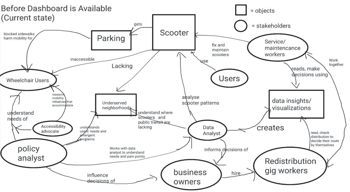
We made a web diagram with a mix of stakeholders and objects to represent the connections between each of the stakeholders and common interests and tasks. This is how we viewed the network of stakeholders and their actions before the implementation of a dashboard. From this we can see which stakeholders have the most in common and how they interact with each other.
Current State Model
We created another web diagram to represent how the implementation of a dashboard could connect and provide information and benefits for each stakeholder. We put the dashboard in the center of the model to show how it has the potential to take on several tasks and accomodate stakeholders with the information most pertinant to their roles.
Future State Model
Key Stakeholders
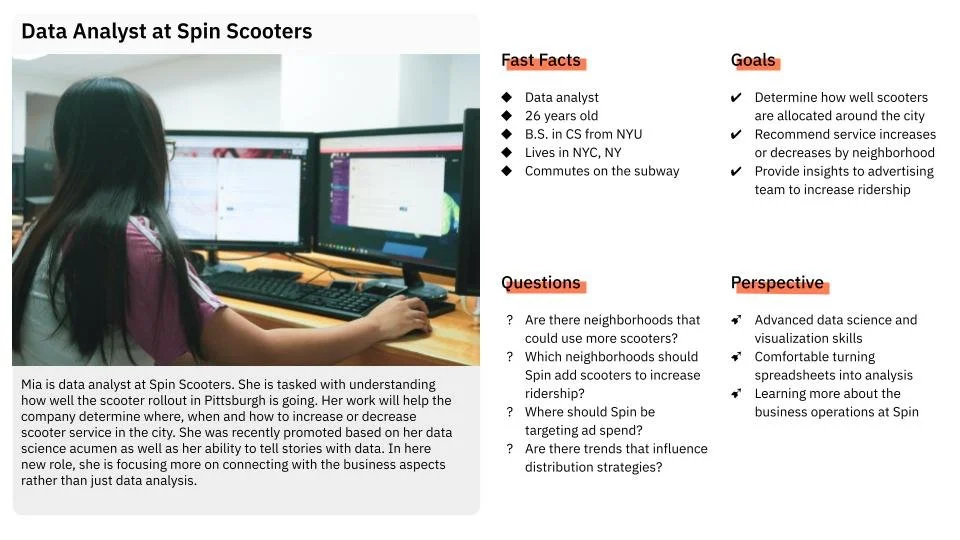
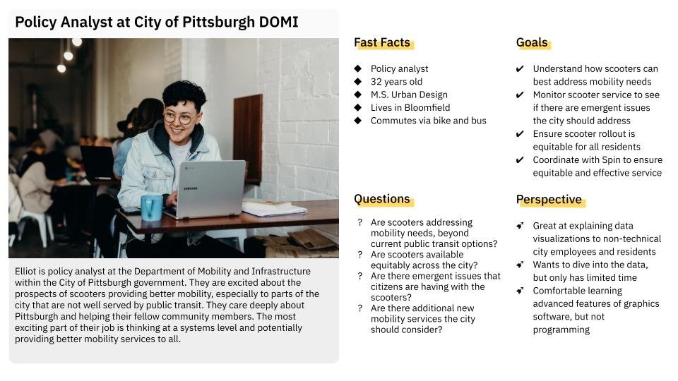
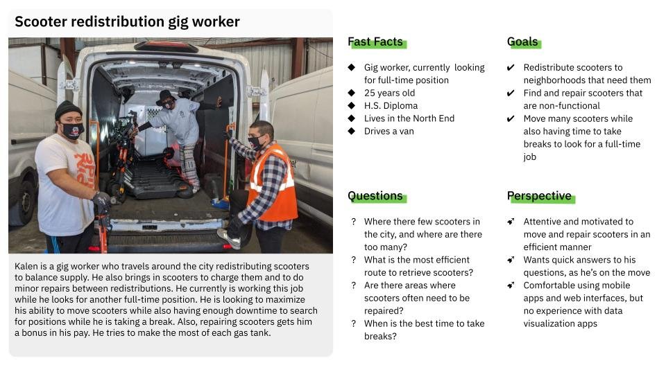
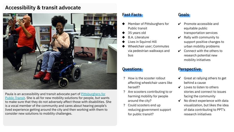
Before thinking about the dashboard, our team defined different personas for four key stakeholders: Mia, the data analyst, Elliot, the policy analyst, Kalen, the redistribution gig worker, and Paula, the accessibility advocate.

Analysis
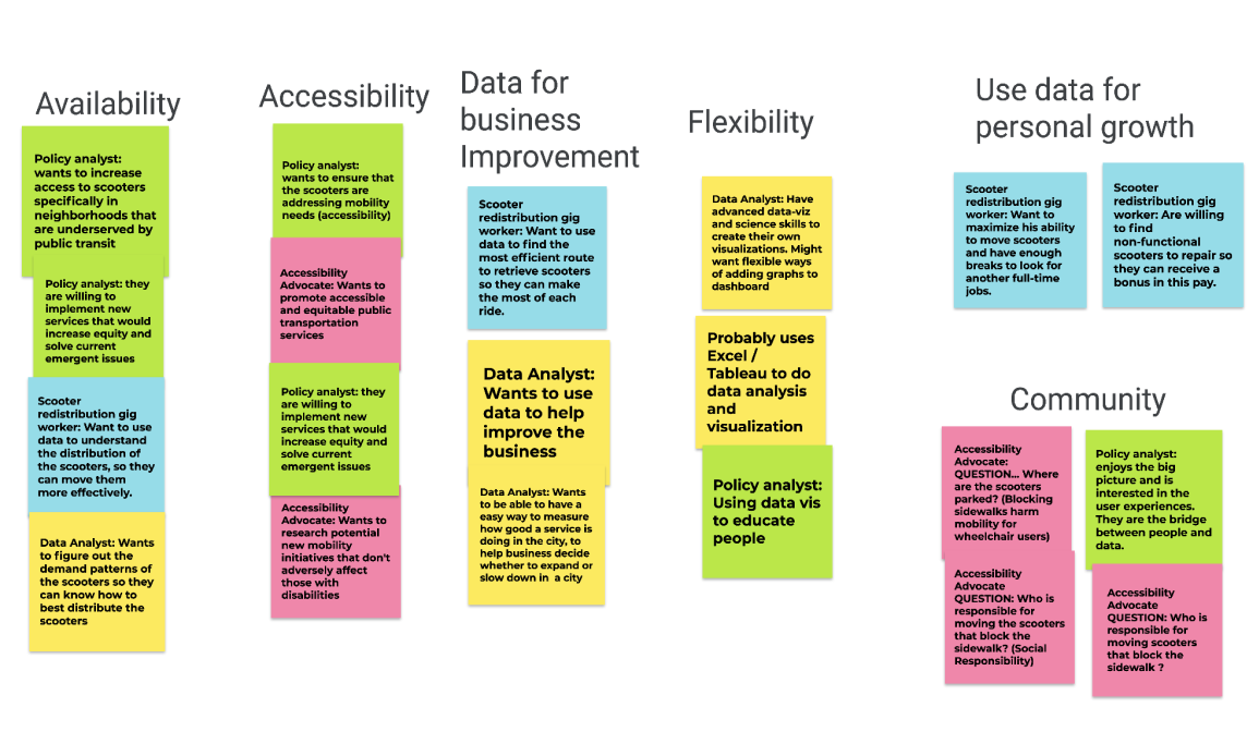
Affinity Diagramming
We made an affinity diagram to understand the roles of each persona and identify similarities. From this diagram, we realized that scooter distribution is a key concept that is important for several of the personas including the policy analyst, the data analyst and the gig worker. We also recognized that data visualization had the potential to inform and educate the personas: data analysts may use it to make business and structural decisions and to let gig workers know of the current status and distribution of the scooters.
Choosing Personas
As a team, we want to start our design process by narrowing down to two personas first, so that we can ensure the dashboard adaquately addresses the needs of the two personas. We chose to create a dashboard for Kalen, the redistribution gig worker, and Mia, the data analyst, because we felt they represented the backbone of Spin scooters. Kalen is on the streets maintaining scooters and ensuring their availability while Mia is interested in taking in scooter traffic and parking density to inform decisions for new parking stations, distribution locations and collaborations with businesses. We hope that a dashboard for them can help Kalen and Mia do their jobs and achieve their own personal goals better. This will improve overall business performance and provide better scooter service to Pittsburgh.
Key Findings
For the gig worker, Kalen:
For the data analyst, Mia:
Ideation
We started with visual hierarchy and outlining. In the dashboard, we want to include: a map current status of scooters (with overlays), top start and end stations, and scooter demand over time. We want the map to be the main feature, with it being interactive and real-time. It will have overlays specified to Kalen’s use case. We also want to present historical data so Mia may conduct her analysis. We took inspiration from the Spin app to create the scooter iconography. We also tried to create the graph so that tells its own data story.
Iteration 1
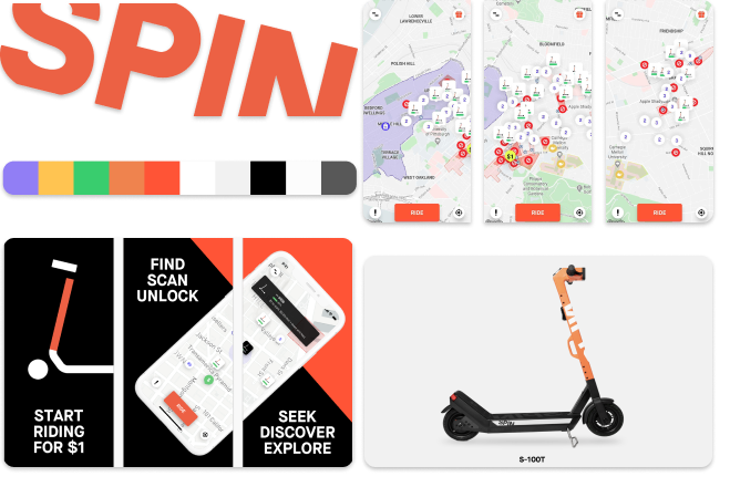
In the next iteration we decided to try and implement our “design language” by setting in some of the basis of how our dashboard should look. We went to Spin’s website and their mobile application to take inspiration from their design elements, and adapt them for use in our dashboard.
In the critique session, we listed out some adjustments that we want to make for the next iteration:
Made the map bigger, as that’s the most interactive, and useful part of the dashboard
Realized dashboard elements are not specifically tailored to address the goals and needs of the persona, thus we want to make that clearer
Tried to reuse elements to make it more applicable to both personas
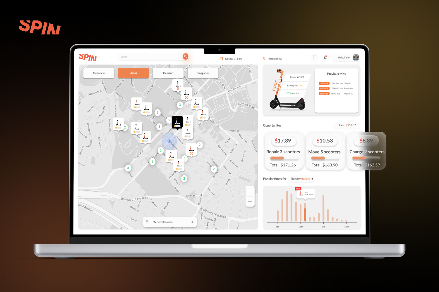
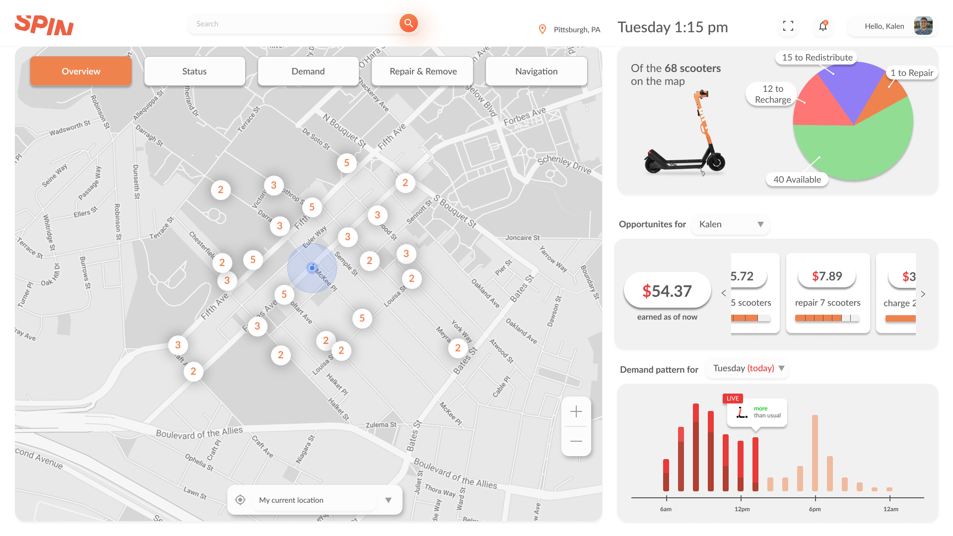
The main things of the overview page that we really thought about was the opportunities section and demand patterns. Opportunites is a very Kalen focused view of what matters to him - making money. Demand pattern is a great way to combine both historical and current demand. It is meant to be a way for Kalen to know he can take breaks.
Key Changes
Overlay concept: We took the ideas of having different overlays on the same map.
Side panel concept: To address separate needs of Mia and Kalen, we make it such that the top right side panel changes based on overlay & persona type.
Battery: We created this overlay to solve Kalen’s issue of needing to know information of the scooter so that he can charge / repair them.
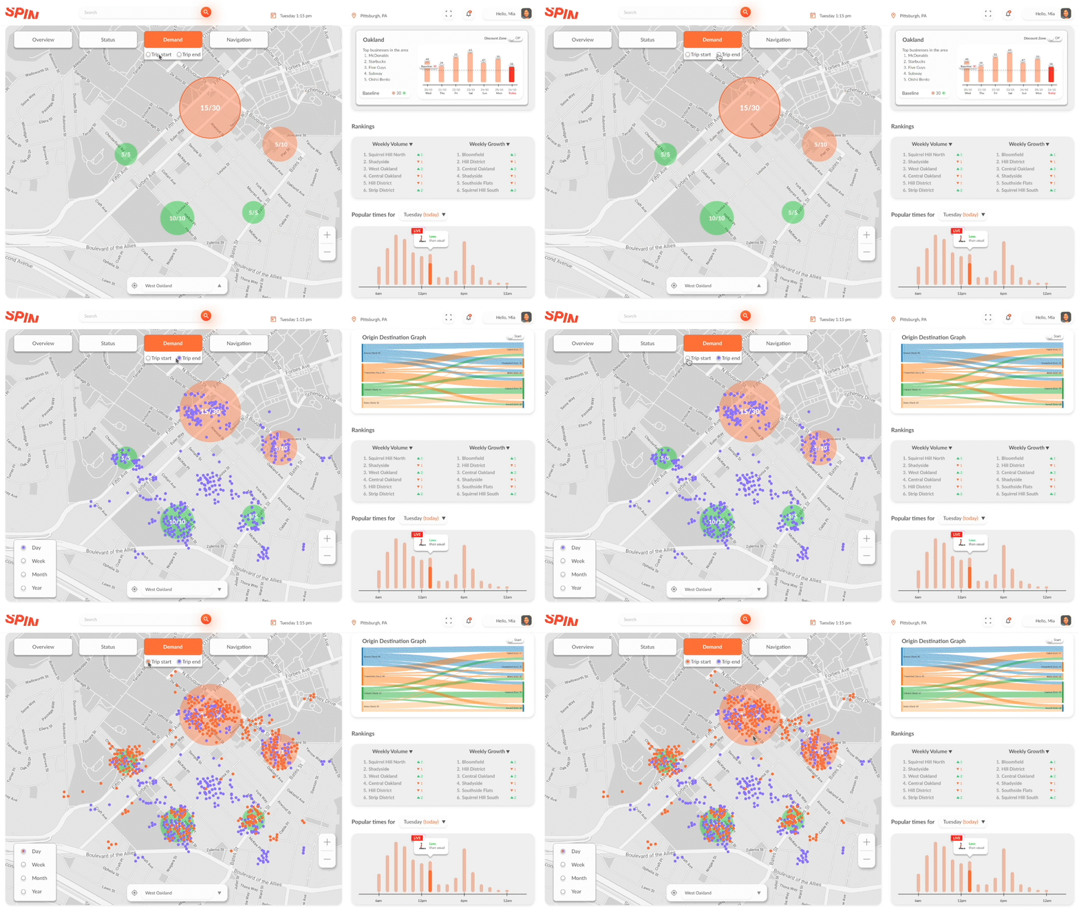
Demand: Helps answer where are there few scooters in the city, and where are there too many? All while providing it in Kalen’s perspective. A business operations manager can determine the demand, and all kalen needs to know is how many needs to be moved to a certain area. A very actionable view of data.
Whiteboard Brainstorming
Our team mapped an overview of our dashboard on the whiteboards, in talks of how to move forward for the next iteration, making sure that our dashboard efficiently caters to each persona’s needs. Here are some major points of Discussion
As of Iteration 2, we felt most confident that Kalen’s view of the dashboard met his needs for redistribution/repair/navigation very well.
We revisited Mia’s persona and brainstormed dashboard components that help her analyze data about scooter rollout and come up with ideas to promote ridership and potential business collaborations (See next page for detailed component ideas).
How can we best display our filters so that Kalen and Mia’s needs are all met through the same dashboard?
How should our filters be labeled?
What information should stay the same between Mia and Kalen’s dashboards? What changes?
We worked out some key components for Mia’s view of the dashboard:
We went ahead and implemented ideas that are discussed in the whiteboard brainstorming. Kalen and Mia interact with the same dashboard layout, but the side panel shows information specific to Mia and Kalen’s goals depending on the selected filter.

Solution
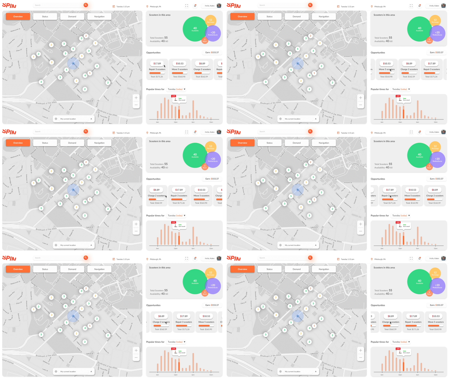
Opportunities
Scroll to see the kinds of jobs that need gig workers to be done.

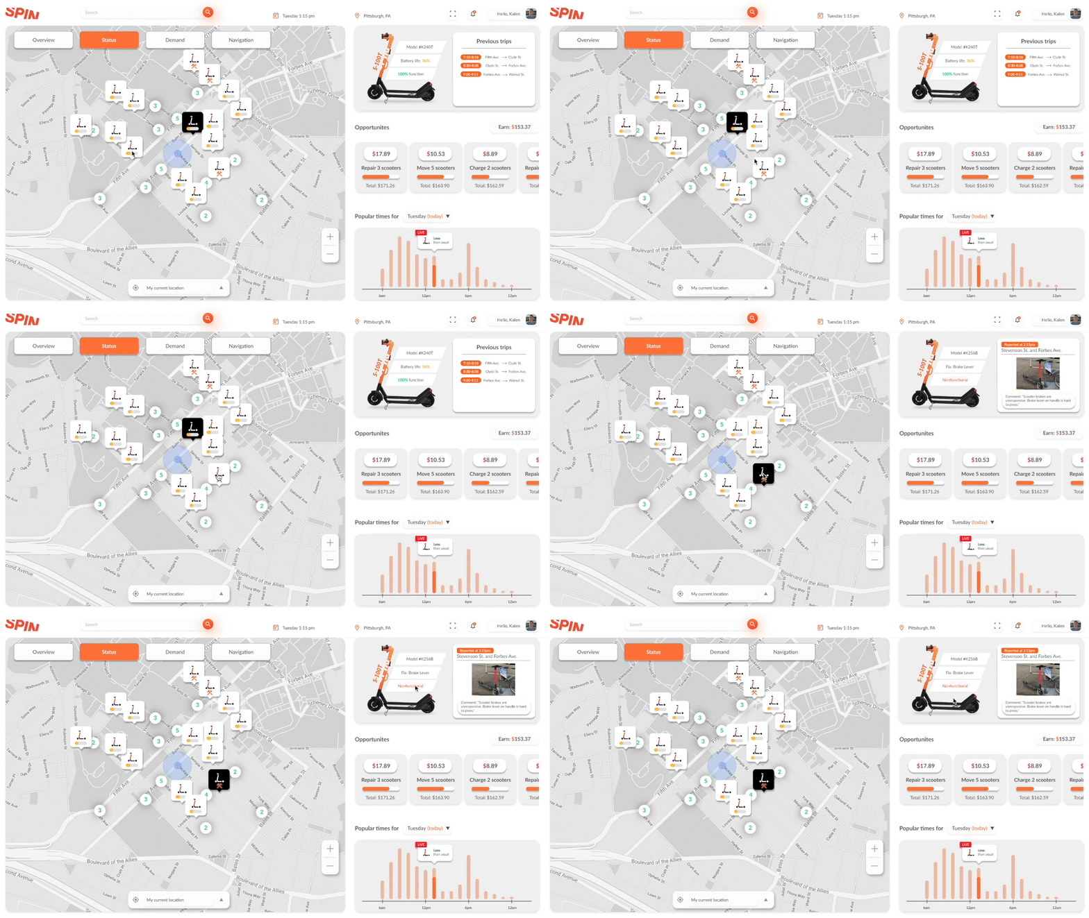
Scooter status
View each scooter’s location, status and history to facilitate redistribution.

Scooter density
Check out scooter density to analyze trends or patterns.
Final Design
Gig worker, Kalen’s perspective
Data analyst, Mia’s Perspective

