BACKGROUND
What is Care Orchestrator?
Care Orchestrator is Philips’ B2B SaaS innovation—a cloud-based application that connects homecare providers, physicians, and payers with patients throughout the health continuum. It gives you the power and flexibility to manage and optimize care for your sleep and respiratory patients.
TASK
Redesign the patient header
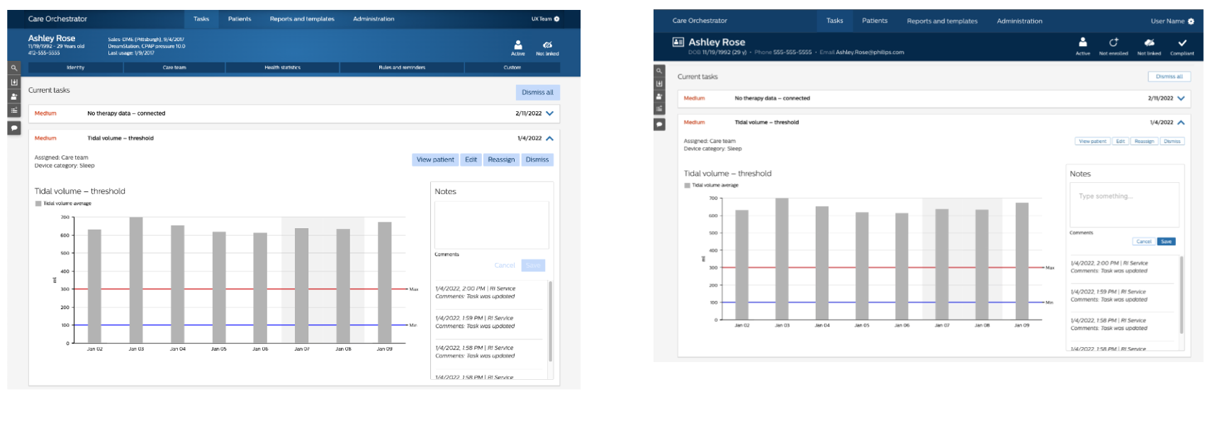
The goal of this project was to reimagine the patient header and navigation elements of the Care Orchestrator (CO) platform to achieve a seamless integration with Philips' Design Language System (DLS). A key focus was placed on enhancing the usability and visual harmony of these components to elevate the overall navigation experience for users.
My Role
Conducted in-depth analyses to understand industry context, business objectives, and market trends for strategic design direction.
Crafted and refined design concepts through sketching and prototyping, articulating key design insights.
Harmonized product designs with the Design Language System to ensure brand consistency and enhance user experience.
Collaborated with 2 UX designers, 1 product owner, and 1 scrum master using Agile frameworks (Sprints, PI, Story) to support rapid implementation and testing of new features.
PROBLEM
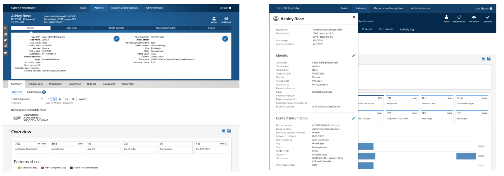
Pain points of the current header
The current Care Orchestrator (CO) patient header was critically analyzed to pinpoint the core issues impeding optimal user experience.
This examination revealed three friction points:
Complex Navigation: The platform's navigation structure was found to be intricate and non-intuitive, obscuring clear pathways for users and compromising discoverability.
Content Overload: An unclear content hierarchy, coupled with redundant controls, added unnecessary complexity, challenging users to discern primary from secondary functions.
Inconsistent Visual Design: The patient header suffered from visual clutter and lacked alignment with the Philips Design Language System, leading to a distracting interface that undermined interaction efficiency.
IDEATION
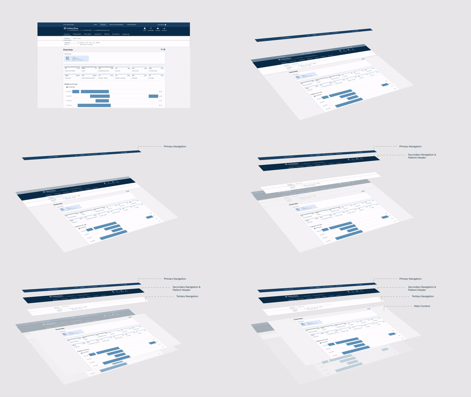
Restructuring the information architecture
TESTING
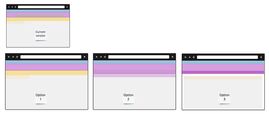
Comparing two approaches
Approach 1
Approach 2
FINAL DESIGN
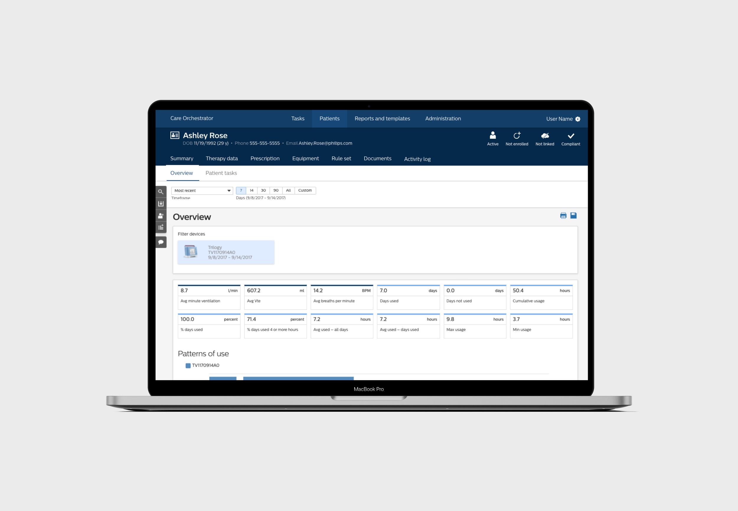
Simplified navigation
Improved hierarchy
Responsive content
Promotional video
Design comparisons
Current
New
New
Current
New
Current
Design handoff
IMPACT
Success metrics
The redesign of the Care Orchestrator's information architecture yielded significant improvements, as measured against our key success metrics:
Simplified: The complexity of navigating through the platform was markedly reduced, as evidenced by a decrease in the average number of clicks required to perform tasks. The information was efficiently consolidated into a single, intuitive sidebar, enhancing the overall ease of use and user satisfaction.
Consistent & accessible: By adhering to the Philips Design Language System, the platform now features a harmonious visual flow with high-contrast elements, standardized font sizes, and color schemes that not only improve aesthetics but also ensure accessibility compliance with AA standards.
Responsive: The redefined content structure is now responsive to various screen sizes, catering to diverse user needs. This adaptive design approach has resulted in a more personalized and focused interaction for users across different devices, further simplifying the user journey.
Key data include:
Gained a 100% satisfaction rate from 6 B2B customers.
Improved product recognition by increasing the DLS core from 73 to 81.
The task duration is 40% less than before.


